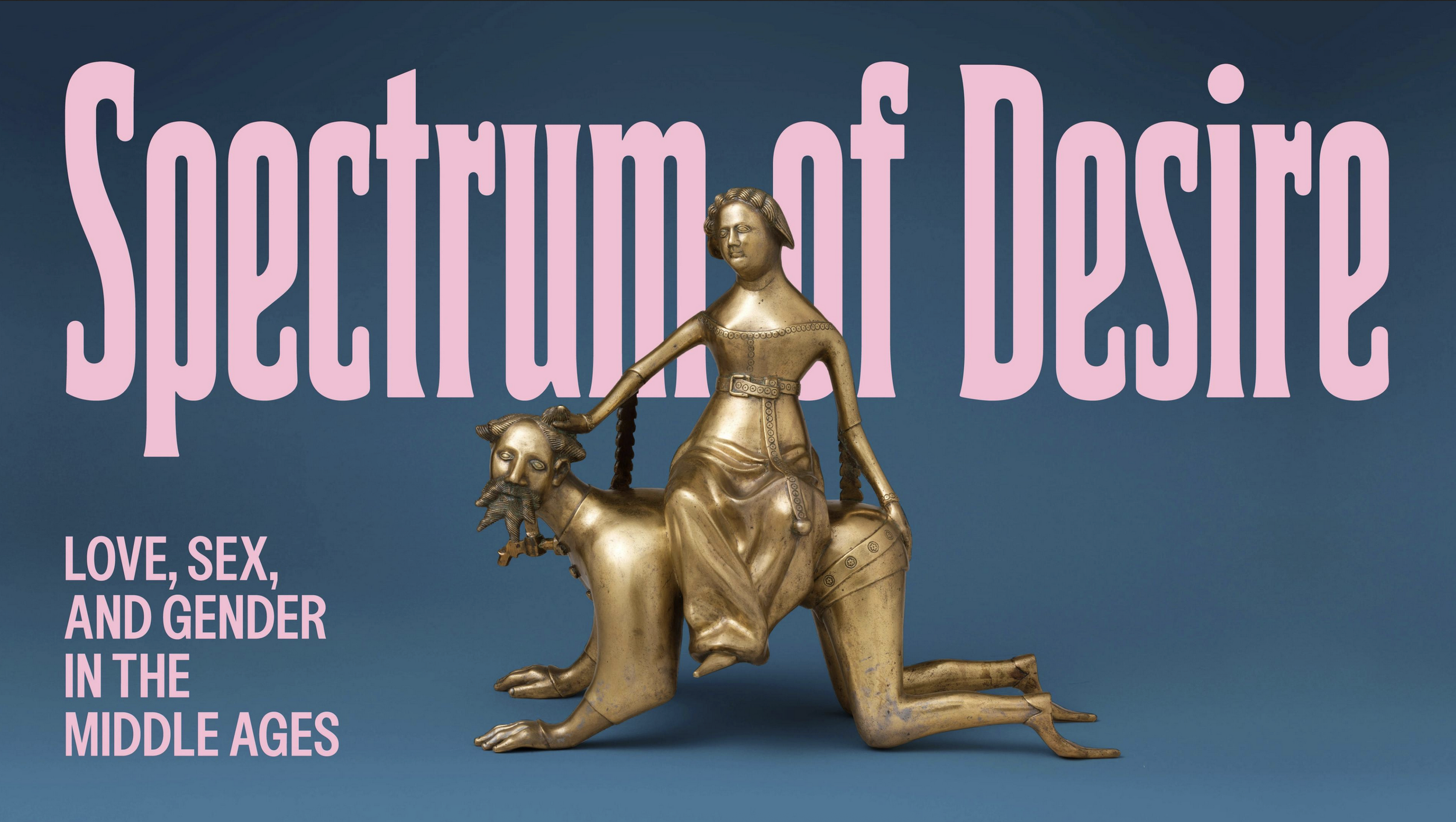
Stepping toward the arched stone entry leading into Spectrum of Desire: Love, Sex, and Gender in the Middle Ages, currently on view through March 29, 2026 at The Met Cloisters, I was struck by the way the physical design subtly hinted at the exhibition’s project of subversion and contradictions. Here, a lavish swath of deep turquoise taffeta drapes softly over the cool stone doorway, swept up and over to one side inviting visitors to enter while simultaneously defining the space within as something separate, different, perhaps even private.
As I followed my group beyond the curtain, the loose weave of the jewel tone silk turned almost translucent, catching the rays of light beaming through the narrow ancient windows at the opposite end of the gallery. An intimate fabric, the lush silk tempts as it conceals, like a canopy bed or the skirt of an elegant ballgown, setting the tone for a show that daringly challenges commonplace perceptions of the Medieval era as one defined solely by austere piety. Instead, Spectrum encourages visitors to consider the inhabitants of the time as real people with nuanced desires, motivations, and complex understandings of love, sex, and gender. In essence, revealing how the concerns around these subjects, which so many of us assume to be exclusively modern, were in fact deeply embedded in medieval thought, practices, and notably, its art…
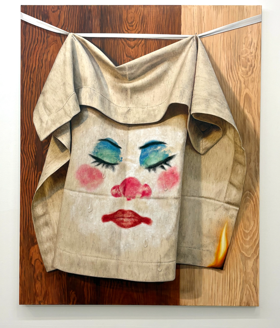
Read MoreI try to remember to pack a few black washcloths when I travel for work. I place them next to the hotel sink, ready to be used when I get back from a shoot, sparing the provided pristine towels from smears of jet black mascara and kisses of Dior 999. When I forget, the association is immediate. A face imprinted on cloth. An unintentional self-portrait—not of my own face, but of the one I wear to do my work…
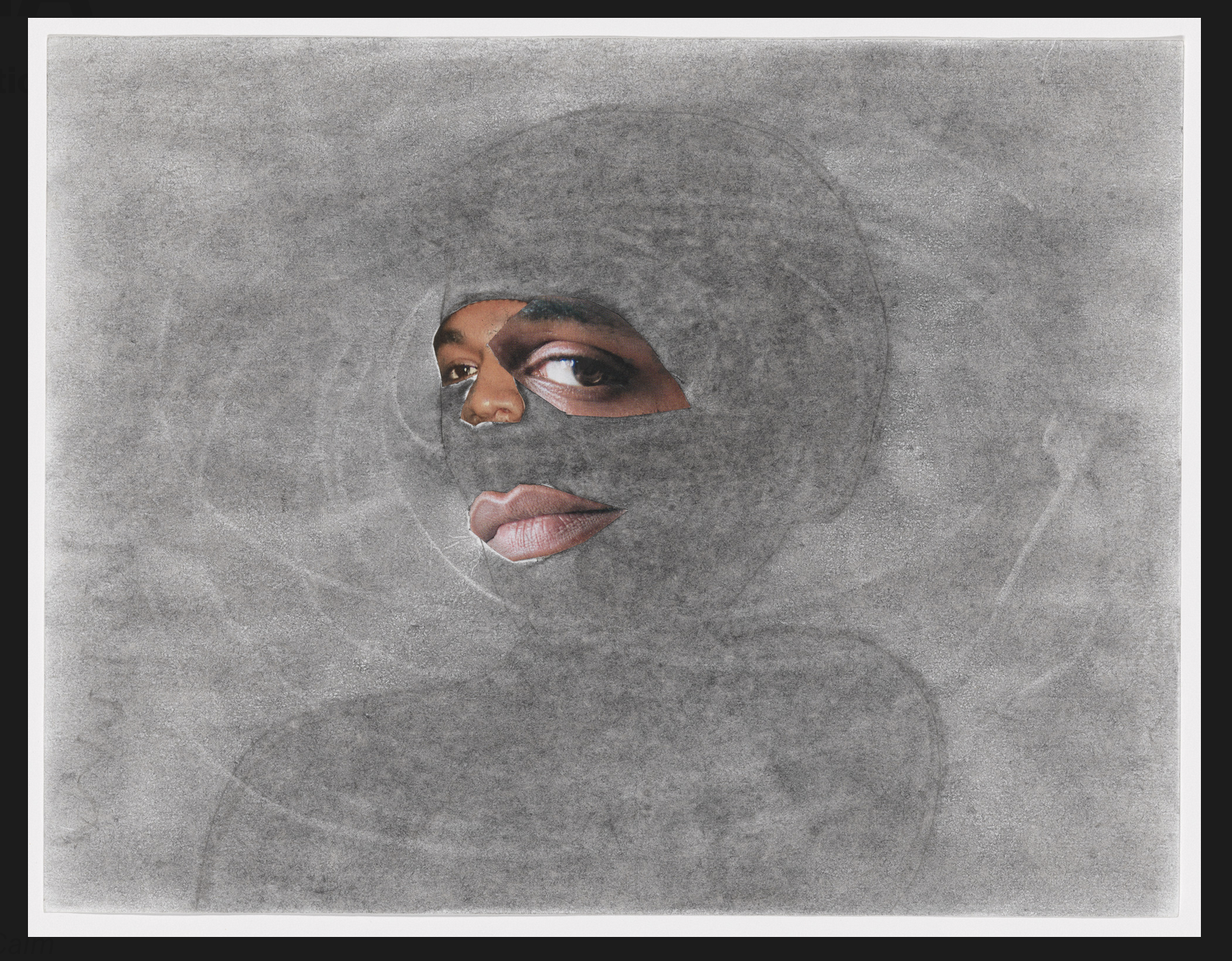
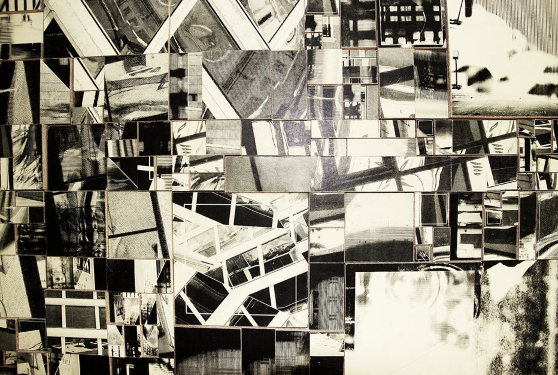
Read MoreThe marquee image for the 2020 MoMA PS1 exhibition “Marking Time: Art in the Age of Mass Incarceration” curated by Dr. Nicole Fleetwood, is from a mixed-media portrait titled “Locked in a Dark Calm,” by the artist Tameca Cole. Though in digital reproduction it appears substantial, it is a relatively small piece—only about the size of a standard sheet of printer paper. In the work, the fragmented figure of a Black woman looks out from the center of a swirling charcoal and graphite cloud which extends to the edges of the page. The head and torso of the woman appear in a gray shadow, mostly obscured by a charcoal maelstrom that swirls in haphazard loops around and through the central figure, mummifying the silhouette. Collaged over the whorls in the center of the page are the parts of a face cut from magazines: a pair of full unpainted lips, a nose, and a pair of dark brown eyes—one stoically gazing off-center into the distance. The other, significantly larger, and side-eyeing directly out from the canvas as if keeping a skeptical, watchful eye on the viewer…
Read MoreDear Lars,
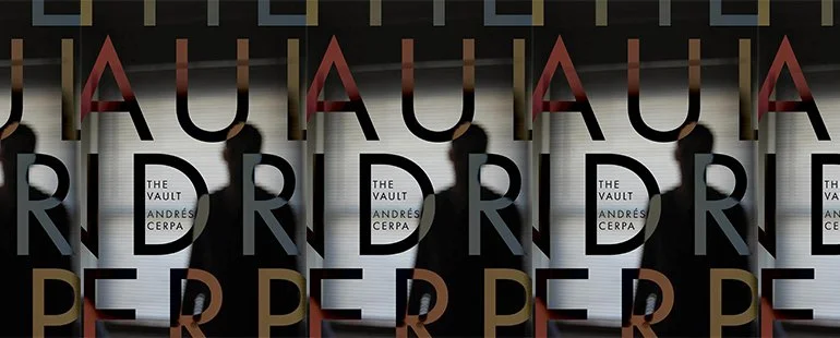
I remember you telling me Cerpa is Puerto Rican, and I was particularly looking forward to spending time with his work here in this dearth of Latino-ness. Even when there is nothing specifically “Latin” or “Puerto Rican” in the work, I always have this underlying sense that somewhere along the line there must be a dash of commonality. Even something as tiny as a type of food, a phrase, a tradition, a habit. Something in the recipe of this person that mirrors the recipe of my person that eventually sneaks into the work itself like a form of common terroir. Not that this equals knowing.
One of our filming days here is set aside as a “Promo Day,” where we do things like photoshoots for the show poster and ads, video interviews with the publicity team, etc. (This may feel like a digression, but I promise it’s not.) One question I’m asked over and over is “How does food build bridges between cultures?” I hate this question because it oversimplifies and makes assumptions…
Read MoreOctober 2024
Nashville, TN
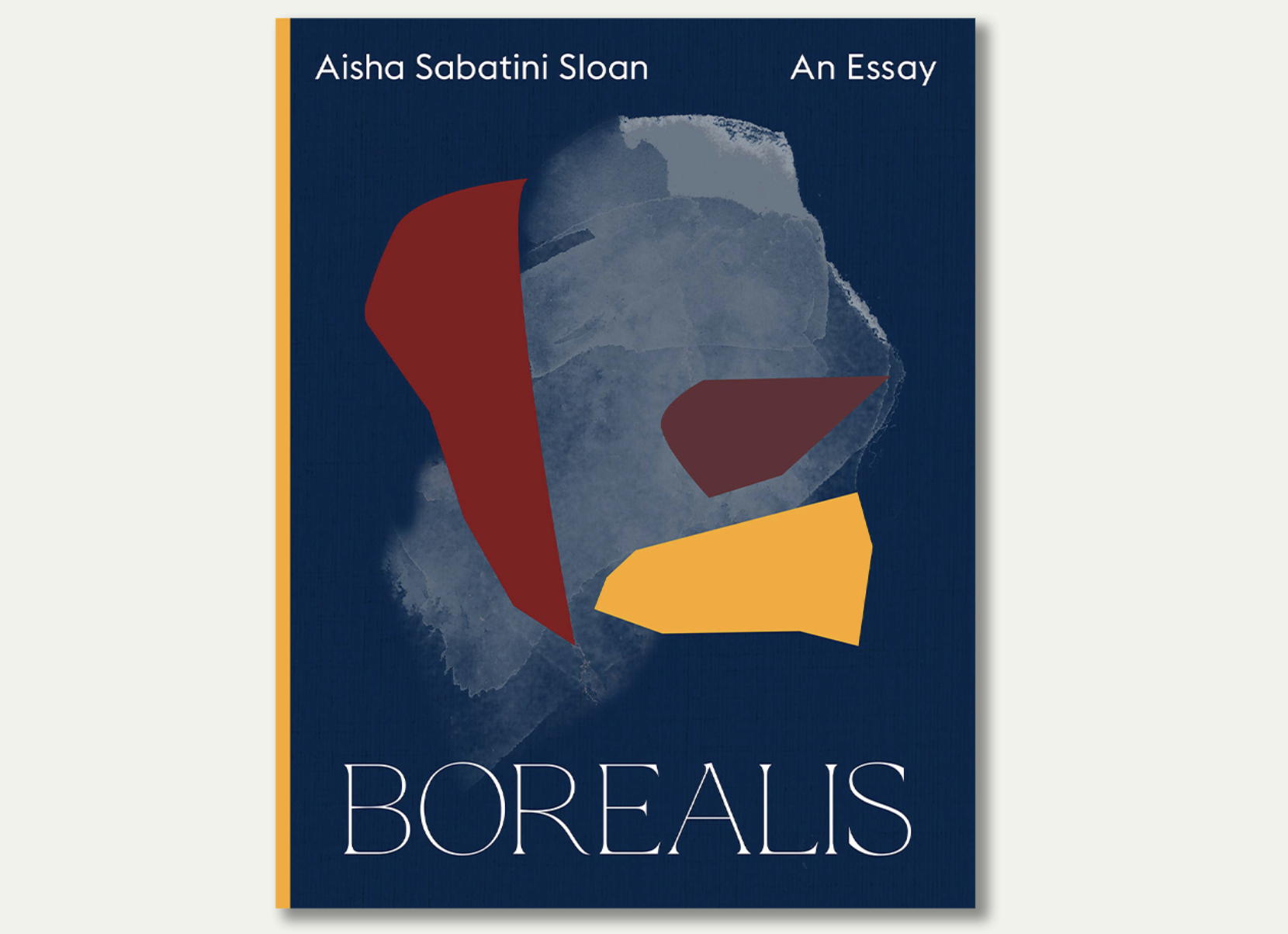
In Response to Borealis by Aisha Sabatini Sloan
Dear Lars:
It occurs to me that we never discussed specific parameters for this reading journal, but I feel drawn to a letter format, partially inspired by the letter-style foreword to Aisha Sabatini Sloan’s Borealis.
That was, in fact, the first thing that struck me about the work. It’s something I can’t recall ever having seen before although it makes perfect sense. I suddenly feel like every foreword is in some way, a letter, (signed, dated, in conversation with the work, etc.) though I suppose they usually addresses the reader rather than the author. I like this new-to-me approach and feel like it’s something I may want to use in the future when writing introductions or blurbs—I’m often stuck with what/how to write and suspect the idea of framing it in my mind as a letter to the author could prove helpful.
One of the other things I noticed as I started to move through the work was a feeling that I was reading the structural mirror image of Jenny Bouley’s The Body: An Essay. There we had footnotes with no essay; here we have a highly referential essay with absolutely no explanatory footnotes.
Reading Borealis, I felt equally unmoored, with…
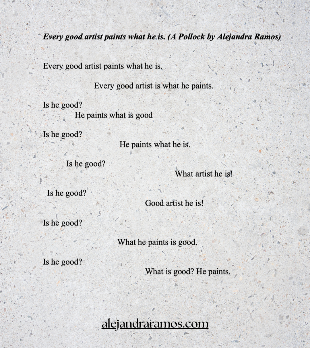
Read MoreCreated by the poet, curator, and art critic, John Yau (b. 1950), a “Pollock” is a playful and inventive poetic form that pays homage to the work of the abstract expressionist painter Jackson Pollock (1912 - 1956). The “rules” are simple and reminiscent of Pollock’s own methods. Yau first used the form in a poem called “830 Fireplace Road: Variations on a sentence by Jackson Pollock.”
A Pollock is a 14-line poem that must begin with a line or quotation said by the artist. This initial line serves as your poetic painter’s palette, so to speak, from which you will then create the subsequent thirteen lines…
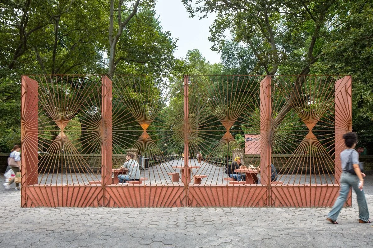
Read MoreThe sunlight streaming through the sepia-red corton steel bars of Edra Soto’s GRAFT (2024) installation at Doris C. Freedman Plaza in Central Park decorates the asphalt terrace with geometric patterns of light and shade that bring forth a flickering rush of memories.
Morning sun rising through the window grates of my cousin’s teenage bedroom while someone brews coffee down the hall. The coolness of the damp golden sand shielded by palm frond silhouettes. Fading light sinking down textured terracotta walls in my aunt’s Ocean Park courtyard.
Though the work itself also feels familiar, reminiscent of so many homes and places in my family’s native Puerto Rico, there is something specifically about the way Soto’s art interacts with the space it inhabits that strikes a particularly resonant chord.
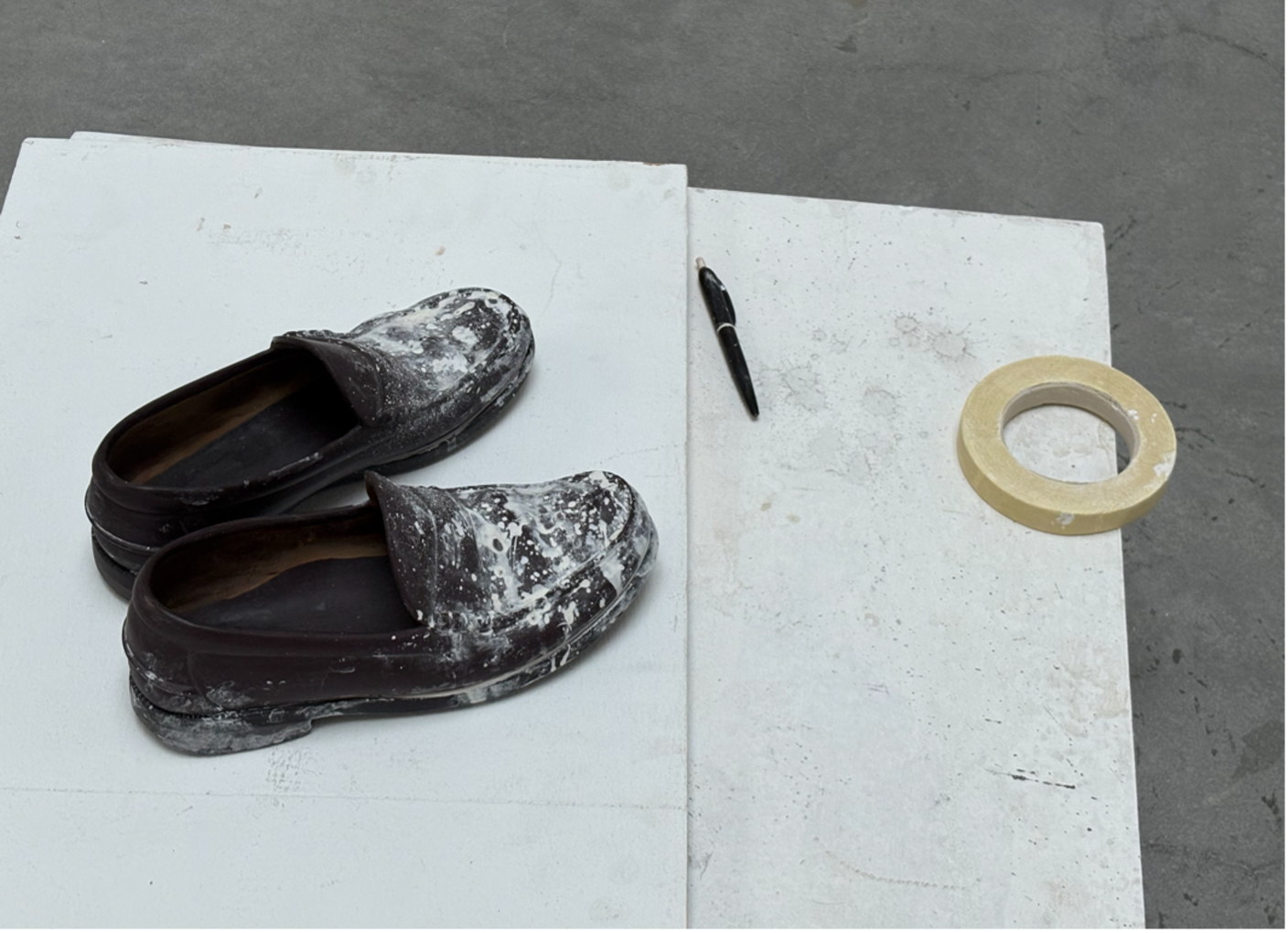
Read MorePeering through the frosted glass door, the gallery looks closed. It’s a few minutes past five and only a handful of people remain on the street, ducking into doors one or two at a time. Most have wandered off to meet friends for happy hour or settle in for an early dinner. Inside, the light feels dimmer than it should be, but I assume it’s intentional and say nothing.
Moments later, a mother hesitates at the door before walking in with her young son. “We thought you were closed!”
The gallery sitter apologizes. I catch only bits of it: Something about how the lights keep flickering. Less annoying to keep them off. It’s better when it’s sunny, but the clouds are thick today.
“We’re just scraping by without light” (I write this part down.)
The boy races to the opposite side of the gallery. The mom laughs like a bell and follows him. He’s free in his movements yet knows enough not to touch.
The brightest part of the room is in the center under a paneled glass skylight that sits directly above a polyurethane copy of…
Read MoreIn her lecture “On Beginnings,” collected in the book Madness, Rack, and Honey, the poet Mary Ruefle considers Gaston Bachelard’s idea that “we begin in admiration and end by organizing our disappointment,” which she simplifies even further into “origins (beginnings) have consequences (endings).” Pulled and paraphrased from Bachelard’s The Poetics of Space, where it originally referred to the practice of poetry and the ways we deal with the intrinsic inadequacies of language, it is a concept that can also be applied to an act even more mystical and bewildering: that of falling in love.
As Ruefle elaborates, “the moment of admiration is the experience of something unfiltered, vital and fresh” not unlike the sense of potential, amazement, and naivete with which one might enter a new romance. As the initial illusions fade and the realities make themselves known, the clarity afforded by disappointment becomes an opportunity to take agency and make decisions in marked contrast with the uncontrolled fall at the onset. Or as Ruefle puts it, a moment of “dignification” where the writer—or for our purposes, the lover—can take back control of the story.
For writer and director Nora Ephron, dignifying the consequences of her origins meant using it as fodder for her literary work. From the Esquire magazine essays that pulled from her daily life to the dynamic romantic comedy heroines she wrote to deliver her personal philosophies on screen like Meg Ryan-shaped ventriloquist puppets, Ephron was an unapologetic miner of her own lived experience; a self-described “cannibal” who took her screenwriter mother’s adage to heart that “everything is copy.”
Read MoreIt begins with a canvas covered from end to end, a single color.
Perhaps orange? Perhaps blue.
(Echoes of a long-ago lesson about restoration: the solid and color-blocked works are more difficult to restore. The simplicity puts the emphasis on the brushstrokes and texture, the errors more noticeable, the damage, the aging, the chips, the fades.)
The canvas is of an average size, slightly larger than a large book, something that can be carried.
(That is the main rule of this.)
We’re calling it reckless and it is a co-creation with accident.
Read More“There was a time when I would rather have had you by my side than any one of these words; I would rather have had you by my side than all the blue in the world.”
I chose Bluets because I wanted to learn how to let go of a dream.
In the first version of that sentence, I wrote: a dream that no longer fit, but then went back and removed that part because it’s not really that the dream doesn’t fit; it’s simply that I want to wear something else, regardless of how good the dress looks.
(Then again, multiple things can be true because I can also think of all the ifs that would have made me want to keep wearing that dress.)
I try to explain this to my best friend, but he doesn’t understand because so many of the ifs went his way. Our conversation keeps getting interrupted because HBO and Hulu are in a bidding war over one of his films. When he returns to the table I say: it doesn’t make sense to you because the same people who keep offering you more, keep offering me less.
Read MoreStepping into Rem Koolhaas’s legendary essay “Junkspace” is a disorienting experience. Existing in a liminal space somewhere between prose poetry and art manifesto, Koolhaas’s words on the state of modern architecture and building design boldly challenge the reader from the onset. One doesn’t need to read a single word to find its 16 pages of justified text, lack of paragraph breaks, and unconventional punctuation, visually arresting. Moving further into the text reveals the content of the essay echoes the incongruity of the style. From its bizarre opening declaration that “Rabbit is the new beef” through to its concluding ellipsis, we immediately recognize that this is not a traditional essay, but rather one that pushes us past the boundaries of the mainstream to deliver its message.
We begin with the one-word title “Junkspace,” which can be read as either uncharacteristically straightforward or frustratingly deprived of context. That this essay is where Koolhaas first introduced this word, which is entirely of his own making, strongly suggests the latter. Either way, the essay is an exploration of junkspace, a term Koolhaas has coined to refer to current trends in buildings and other designed spaces which he finds have devolved into a state of being somehow both function-driven and form-less, where commerce, artifice and expansion dominate all other motives.
The term is a play on the concept of “space-junk,” defined as the debris humans leave behind while exploring space. To Koolhaas, the inverse junkspace “is the residue mankind leaves on the planet”. It is the “fallout” that remains after the program of “modernization has run its course”. Koolhaas seems to lament that despite existing in a time when we are building more and have more freedom than ever before, “we do not register on the same scales. We do not leave pyramids”. We only leave junkspace. In other words, junkspace is the disappointing denoument of humanity’s progress.
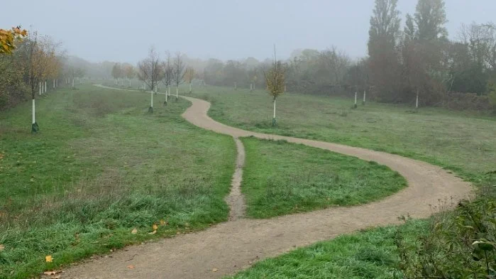
Read MoreI’m endlessly seeking shortcuts. In an effort to buy back precious minutes lost to reasons both cognitive and cultural, I’ve gamified my commutes, perpetually scanning my environment for more efficient ways to get where I need to go. With the precision of a skilled hunter, I skip entire city blocks by cutting through semi-public buildings, calculate the risks of jay walking across thoroughfares, and shamelessly trample diagonally across beautifully manicured, but inconveniently placed lawns. Sidewalks become mere suggestions. “Keep off the lawn” signs? Challenges. My need to get where I need to go as expeditiously as possible always superseding the plans set for me by some distant figure. As creative as these choices may feel, these meanderings are not unique to me, but rather part of a centuries long tradition of living beings charting alternate paths.
They’re called desire paths, an undeniably romantic name conveying sentiments of yearning both illicit and indulgent. At their simplest definition, desire paths—also known as desire lines—are natural unpaved pathways created by human inclination and instinct, rather than planning. It’s the worn dirt path cutting through a grassy college quad. A sandy shortcut leading down to the beach. The track of slushy muddy footprints slashing through an otherwise pristine blanket of white after a snowfall.
The visuals can be arresting, poignant, even humorous, serving to convey seemingly universal truths about animals and humans alike. To some, desire paths are found art waiting to be discovered in the most prosaic of places. An exquisite corpse created collaboratively by paws, feet, or bicycle tires motivated through equal parts impatience and curiosity. To others, the trampled lines take on deeper symbolic meaning representing everything from charming ingenuity and independence to civil disobedience, protest, and even anarchy. In every case, desire paths illustrate a fundamental tension between theory and practice, planning and usage, and the myriad ways humans relate to their built and natural environments.
Read MoreWhen I took my seat at The Joyce Theater earlier this afternoon for a performance of Ayodele Casel’s “The Remix,” something felt very familiar. It was my first time in that performance space, seeing a new-to-me artist, but I couldn’t shake an overwhelming feeling of familiarity. I searched my eyes along the stage, which was dotted with cozy arrangements of chairs and pillows, a clothing rack, an old black & white style box TV. In the background, a DJ was playing music that, while not recognizable as a specific song, again felt familiar. Not quite déjà vu, but close.
The show hadn’t started yet, but some of the dancers were mingling around, stretching, moving and testing out steps. Soon, Ayodele Casel came out on stage, and began to address the audience, talking about her life and memories as a “black and Puerto Rican kid born in the Bronx,” sharing a poem she wrote referencing days spent at Nuyorican Poet’s Café in her 20s, and expressing her deep-seated childhood desire to be a part of all this (spoken with arms spread out wide over the stage, the theater), I understood that what I’d been feeling was a sense of shared memory—shared desire. A recognition of knowledge existing under the surface of the performance, which was about to tell a story so similar to my own.
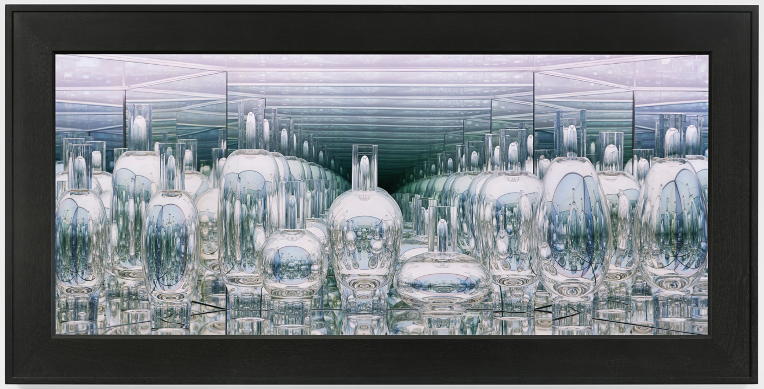
Read MoreIt takes me a few minutes to understand why I feel so uneasy in front of Josiah McElheny’s “From the Library of Atmospheres II.” a sculptural glass assemblage at James Cohan’s 48 Walker Street gallery. It is, I finally realize, because though I am fully aware that I am peering into a world of glass and mirrors, my reflection is missing. Like a child or a puppy encountering an unfamiliar object, I keep stepping closer and further away from the work, tilting my body from side to side, as if convinced that by finding the correct approach I will solve the puzzle presented.
My efforts are in vain. I feel like a vampire. A ghost in the gallery.
McElheny achieves this haunting effect with a simple trick; the clear glass window I am looking through is in fact a two-way mirror like the kind in tv detective show interrogation rooms (perhaps also real ones; I’ve not had the pleasure). Observing this work, I’m intensely hyperaware of my presence in relationship to the art. I am removed, on the outside looking into an enclosed world where McElheny’s carefully arranged hand-blown bottles exist in their own mirrored isolation. It is also an interrogation room of sorts; the bottles in ongoing conversation and observation with themselves—a self-interrogation, an, as McElheny describes, “infinite narcissism.”
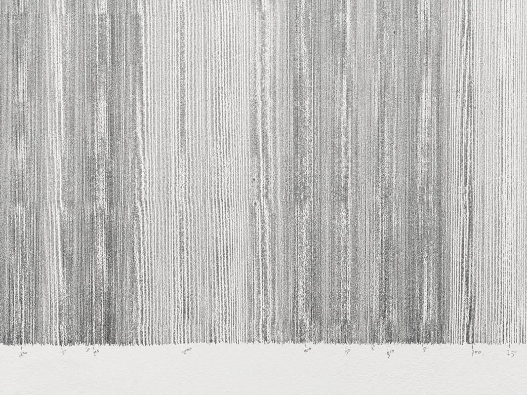
Read MoreThe distance from San Juan, Puerto Rico to El Barrio in Harlem is approximately 1,610 miles. By plane, it’s four hours—give or take tail winds—plus traffic and the TSA line. By boat, a few days with stops along the way. FaceTime and phone calls seemingly shrink the space from here to there, but the expanse swiftly returns. Since 2003, the Puerto Rican-born artist Tony Cruz Pabón has meditated on the true immensity of distance, using graphite pencil to attempt to draw a line the physical length from his San Juan hometown to places elsewhere on the map.
It is an exercise rooted in failure. Each iteration of Cruz Pabón’s Distance Drawings is newly created in situ at galleries and museums around the world, from Berlin to Brazil to his latest attempt in El Museo del Barrio here in New York City. The works are always limited by the time and space allotted by the galleries, as well as the physical demands of the body. Working only with a pencil and a piece of wood that serves as both straightedge and measuring device, Cruz Pabón painstakingly charts these abstract representations of distance and time directly onto the gallery wall, drawing line after line while the other works of the exhibition are mounted around him.
The version in El Museo covers the length of one wall in tightly spaced horizontal lines that wiggle slightly over the natural bumps and texture of the gallery-white paint beneath. The spacing between the thin lines is imperfect, creating patterns of light and dark, a gradient representation of the dark and light aspects of journey, travel, and diasporic experience. Like the final squished-together letters on top of an amateur birthday cake, the lines start to lean and tilt in increasingly more dramatic increments until they reach the opposite wall and cause the artist to run out of space, tiny early errors magnified. Though he worked consistently from morning to night for nearly three weeks prior to the show opening, he was ultimately only able to complete about 5.2 miles of lines, a distance that amounts to a mere .32% of the journey.
Read MoreThe grocery store sends a carton of blue eggs instead of the ones I usually buy. These blue eggs are more expensive, but the store doesn’t charge me the difference. The packaging celebrates the blueness, but the reality is disappointing. Blue chicken eggs only appear blue in contrast to the brown and white chicken eggs. They are not like robin’s eggs which are so distinctly blue that a shade of blue is named for them. Nobody paints their walls Chicken Egg Blue. Eggshell paint, like nude stockings and stilettos, is assumed to be a shade of white.
I look this up to confirm and learn that while, no, there is not a paint called “Chicken Egg Blue,” there is one called “Duck Egg.”
I feel about the blue eggs the same way I felt about the Blue Spruce, which I read about before I saw, imagining a sparkling ultramarine tree. Years ago, I filmed a TV show in the hangar where Howard Hughes built a plane that couldn’t fly. When telling this story, I invariably mix up the plane’s name with the tree’s name.
Goose eggs are always white, but now I have an idea for my sculpture.
Read More